ShopifyPrestige主题的几个优化_知乎_
Shopify官方主题Prestige是一个很好的主题,特别是更新到现在的V5.6.2以后。
OS2.0以后的官方主题Secton Anywhere让做SHOPIFY网页不再困难,即使不用Shogun等工具也可以做出很漂亮的网页。
但是就是这个这么好的主题PRESTIGE主题也是有一些地方不尽人如意,需要我们手动给改一改让它变得更符合我们的要求:
1). 导航菜单下面那条线的颜色更改与大小更改:
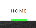
 修改菜单下划线的大小与颜色
那么我们可以在theme.css下面找到这个:
.Header__LinkSpacer::after {
position: absolute;
content: "";
bottom: 0;
left: 0;
width: 100%;
opacity: 0;
transform: scale(0, 1);
transform-origin: left center;
border-bottom: 5px solid #40ff43;(这行是我改的,变成5px粗细, 颜色变成绿色#40ff43)
transition: transform 0.3s, opacity 0.3s;
}
以上只针对菜单没有下拉二级菜单的(MEGA MENU不算),如果有下拉二级菜单的则更改如下:
.DropdownMenu::before {
content: "";
position: absolute;
bottom: 100%;
left: 0;
background: var(--header-heading-color);
width: 100%;
height: 2px;
transform: scale(0, 1);
transform-origin: left center;
transition: transform 0.3s;
border-bottom: 5px solid red; (这行是我加的,用5px的粗细,颜色为红色比如)
}
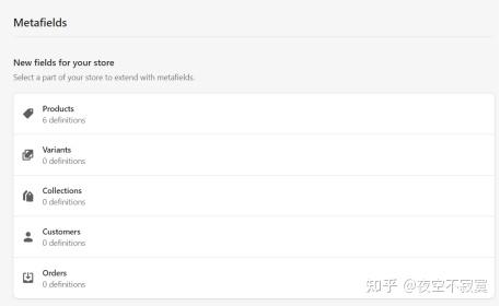
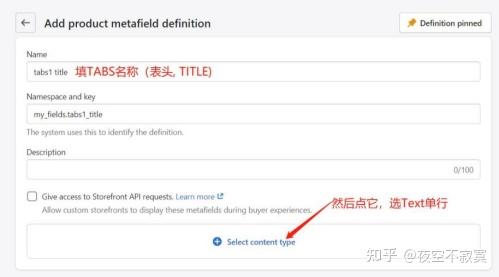
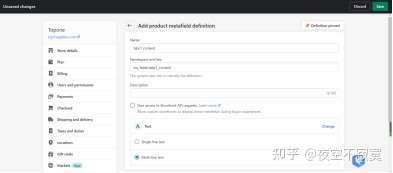
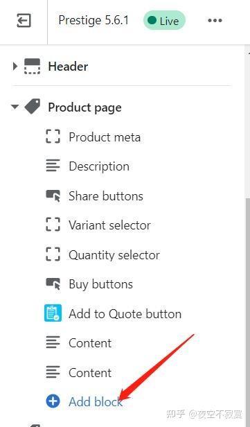
2). 做每个产品独有的产品TABS:
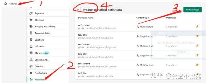
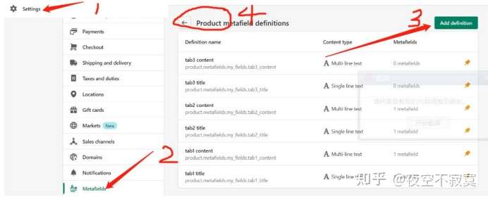
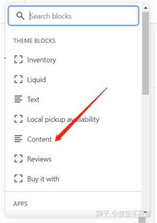
按上面1-2然后出来下面这个点Products,然后点上图的3绿色按钮

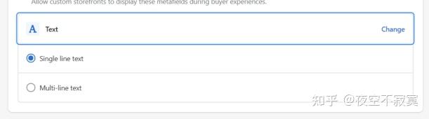
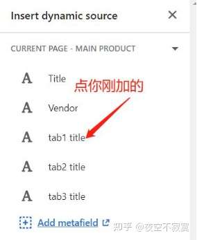
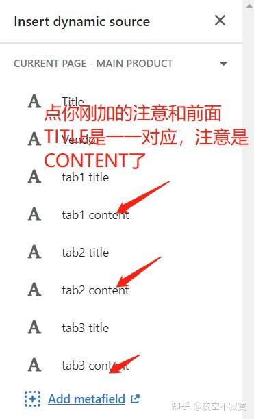
出来如下,输入Tabs Title点蓝色字选TEXT点单行


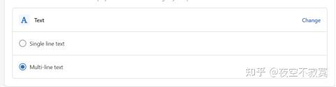
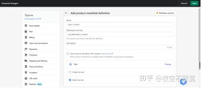
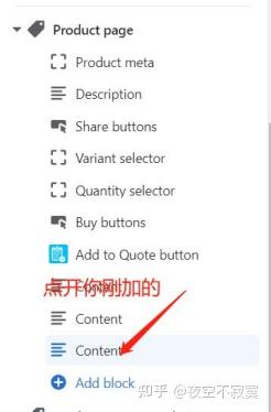
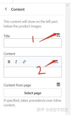
然后重复一次上面的操作;到名称这里改成Tabs 1content即PRODUCT的内容:
最后一步的地方改成:

点右上角保存就可以了。
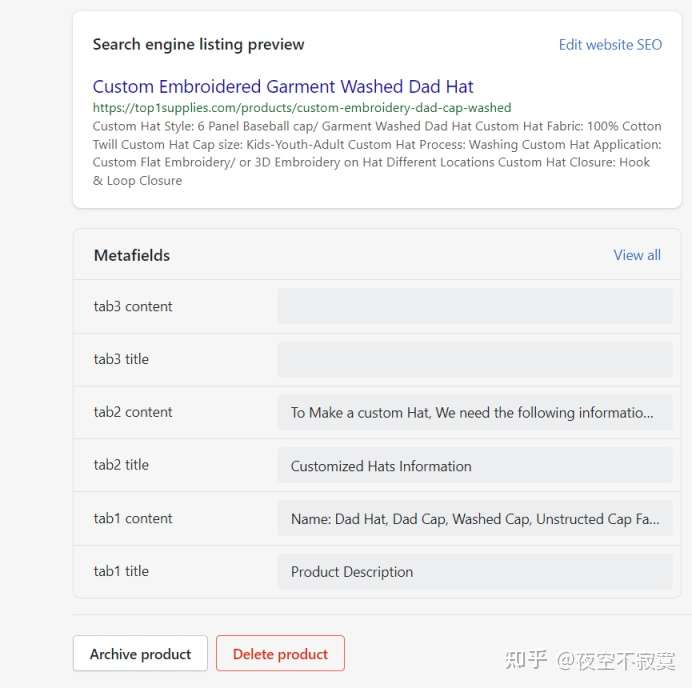
再回到产品页面上去,会看到所有产品的底部都有这些tabs但没有内容,你给加上就可以了title就是标题而content就是相应的内容。

最后一步是挂到这个产品的页面上去:


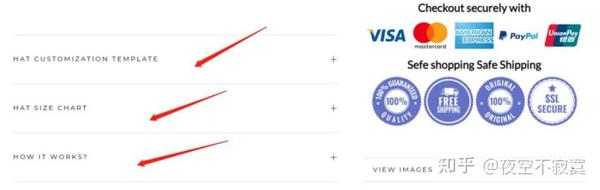
然后结果就出现了,只有这个产品才具有的PRODUCT TABS详情(其它产品会出现其它产品上面写的内容了)。如下图:

3). 产品的页面加CONTACT US如下图:

只需要CUSTOMIZE你的主题然后找到SECTION下面的Main Product然后加以下代码在BUY NOW的按钮下面就可以了:
<br>
<a href="/pages/contact-us" class="Button Button--primary Button--full">Conact us</a>
当然/pages/contact-us也要以改成mailto: 后面加你的邮箱, 这样客户点产品页面的CONTACT US就可以直接给你发电邮了。
4). 幻灯片SECTION的图片按主题是不能点链接到其它的地方,只能是点其中图片上面的按钮才可以链接到其它地方。很多同学都想要图片链接到其它地方怎么办呢?
解决方案:CUSTOMIZE主题以后进去找到SECTION下面的SLIDERSHOW,然后把这个整版代码替换原有的代码就可以了:
{%- capture flickity_options -%}
{
"prevNextButtons": false,
"setGallerySize": {% if section.settings.show_fullscreen %}false{% else %}true{% endif %},
"adaptiveHeight": {% if section.settings.show_fullscreen %}false{% else %}true{% endif %},
"wrapAround": true,
"dragThreshold": 15,
"pauseAutoPlayOnHover": false,
"autoPlay": {% if section.settings.autoplay %}{{ section.settings.cycle_speed | times: 1000 }}{% else %}false{% endif %},
"pageDots": {% if section.blocks.size > 1 %}true{% else %}false{% endif %}
}
{%- endcapture -%}
<section id="section-{{ section.id }}" data-section-id="{{ section.id }}" data-section-type="slideshow">
<div class="Slideshow {% if section.settings.show_fullscreen %}Slideshow--fullscreen{% endif %}">
<div class="Slideshow__Carousel {% if section.settings.show_arrow %}Slideshow__Carousel--withScrollButton{% endif %} Carousel Carousel--fadeIn {% if section.settings.show_fullscreen %}Carousel--fixed{% endif %} Carousel--insideDots"
data-flickity-config={{ flickity_options }}>
{%- for block in section.blocks -%}
{%- capture slide_content -%}
{%- comment -%}
Implementation note: this is an art driven image selection so it would have been better to be able to use the "picture" tag instead. However,
as the mobile and desktop image could have different aspect ratio, the image allocation space would not have work properly without explicitly
distinguishing the two images, hence the two containers.
{%- endcomment -%}
{%- assign mobile_image = block.settings.mobile_image | default: block.settings.image -%}
{% if block.settings.image_link != blank %}
<a href="{{ block.settings.image_link }}">
{% endif %}
{%- if mobile_image -%}
<div class="Slideshow__ImageContainer {% if block.settings.apply_overlay %}Image--contrast{% endif %} {% unless section.settings.show_fullscreen %}AspectRatio{% endunless %} hidden-tablet-and-up"
style="{% unless section.settings.show_fullscreen %}--aspect-ratio: {{ mobile_image.aspect_ratio }};{% endunless %} background-image: url({{ mobile_image | img_url: 1x1, format: jpg }})">
<img class="Slideshow__Image Image--lazyLoad"
src="{{ mobile_image | img_url: 1x1 }}"
data-src="{{ mobile_image | img_url: x800 }}"
alt="{{ mobile_image.alt | escape }}">
<noscript>
<img class="Slideshow__Image" src="{{ mobile_image | img_url: x800 }}" alt="{{ mobile_image.alt | escape }}">
</noscript>
</div>
{%- endif -%}
{%- if block.settings.image -%}
<div class="Slideshow__ImageContainer {% if block.settings.apply_overlay %}Image--contrast{% endif %} {% unless section.settings.show_fullscreen %}AspectRatio AspectRatio--withFallback{% endunless %} hidden-phone"
style="{% unless section.settings.show_fullscreen %}padding-bottom: {{ 100.0 | divided_by: block.settings.image.aspect_ratio }}%; --aspect-ratio: {{ block.settings.image.aspect_ratio }};{% endunless %} background-image: url({{ block.settings.image | img_url: 1x1, format: jpg }})">
{% assign image_url = block.settings.image | img_url: 1x1 | replace: _1x1., _{width}x. %}
<img class="Slideshow__Image Image--lazyLoad hide-no-js"
data-src="{{ image_url }}"
data-optimumx="1.2"
data-widths="[400, 600, 800, 1000, 1200, 1400, 1600, 1800, 2000, 2200]"
data-sizes="auto"
alt="{{ block.settings.image.alt | escape }}">
<noscript>
<img class="Slideshow__Image" src="{{ block.settings.image | img_url: 1000x }}" alt="{{ block.settings.image.alt | escape }}">
</noscript>
</div>
{%- else -%}
<div class="Slideshow__ImageContainer {% if block.settings.apply_overlay %}Image--contrast{% endif %} {% if section.settings.show_fullscreen %}PlaceholderBackground{% endif %} PlaceholderSvg--dark">
{%- capture placeholder -%}{% cycle lifestyle-1, lifestyle-2 %}{%- endcapture -%}
{{ placeholder | placeholder_svg_tag: Slideshow__Image PlaceholderBackground__Svg }}
</div>
{%- endif -%}
</a>
{%- capture slideshow_content -%}
{%- if block.settings.subheading != blank -%}
<h3 class="SectionHeader__SubHeading Heading u-h6">{{ block.settings.subheading | escape }}</h3>
{%- endif -%}
{%- if block.settings.title != blank -%}
<h2 class="SectionHeader__Heading SectionHeader__Heading--emphasize Heading u-h1">{{ block.settings.title | escape }}</h2>
{%- endif -%}
{%- if block.settings.button_1_text != blank and block.settings.button_2_text != blank -%}
{%- assign has_two_buttons = true -%}
{%- else -%}
{%- assign has_two_buttons = false -%}
{%- endif -%}
{%- if block.settings.button_1_text != blank or block.settings.button_2_text != blank -%}
<div class="SectionHeader__ButtonWrapper">
<div class="ButtonGroup ButtonGroup--spacingSmall {% if has_two_buttons %}ButtonGroup--sameSize{% endif %}">
{%- if block.settings.button_1_text != blank -%}
<a href="{{ block.settings.button_1_link }}" class="ButtonGroup__Item Button">{{ block.settings.button_1_text | escape }}</a>
{%- endif -%}
{%- if block.settings.button_2_text != blank -%}
<a href="{{ block.settings.button_2_link }}" class="ButtonGroup__Item Button">{{ block.settings.button_2_text | escape }}</a>
{%- endif -%}
</div>
</div>
{%- endif -%}
{%- endcapture -%}
{%- if slideshow_content != blank -%}
<div class="Slideshow__Content Slideshow__Content--{{ block.settings.content_position }}">
<header class="SectionHeader">
{{ slideshow_content }}
</header>
</div>
{%- endif -%}
{%- endcapture -%}
{%- comment -%}This code allows to cover a common use case where merchant would like to have a clickable image{%- endcomment -%}
{%- if block.settings.button_1_text == blank and block.settings.button_1_link != blank -%}
<a href="{{ block.settings.button_1_link }}" id="Slide{{ block.id }}" class="Slideshow__Slide Carousel__Cell {% if forloop.first %}is-selected{% endif %}" {% if forloop.first %}style="visibility: visible"{% endif %} data-slide-index="{{ forloop.index0 }}" {{ block.shopify_attributes }}>
{{- slide_content -}}
</a>
{%- else -%}
<div id="Slide{{ block.id }}" class="Slideshow__Slide Carousel__Cell {% if forloop.first %}is-selected{% endif %}" {% if forloop.first %}style="visibility: visible"{% endif %} data-slide-index="{{ forloop.index0 }}" {{ block.shopify_attributes }}>
{{- slide_content -}}
</div>
{%- endif -%}
{%- endfor -%}
</div>
{%- if section.settings.show_arrow -%}
<button data-href="#section-{{ section.id }}-end" class="Slideshow__ScrollButton RoundButton RoundButton--medium" aria-label="{{ general.accessibility.scroll_to_content | t }}" data-animate-bottom>
{%- render icon with arrow-bottom -%}
</button>
{%- endif -%}
</div>
<span id="section-{{ section.id }}-end" class="Anchor"></span>
</section>
<style>
#section-{{ section.id }} .Heading,
#section-{{ section.id }} .flickity-page-dots {
color: {{ section.settings.text_color }};
}
#section-{{ section.id }} .Button {
color: {{ section.settings.button_color }};
border-color: {{ section.settings.button_background }};
}
#section-{{ section.id }} .Button::before {
background-color: {{ section.settings.button_background }};
}
{%- if settings.show_button_transition -%}
@media (-moz-touch-enabled: 0), (hover: hover) {
#section-{{ section.id }} .Button:hover {
color: {{ section.settings.button_background }};
}
}
{%- endif -%}
</style>
{% schema %}
{
"name": "Slideshow",
"class": "shopify-section--slideshow",
"max_blocks": 5,
"settings": [
{
"type": "checkbox",
"id": "show_fullscreen",
"label": "Show full-screen images",
"info": "If enabled, images will be resized to fit the entire screen.",
"default": false
},
{
"type": "checkbox",
"id": "show_arrow",
"label": "Show bottom arrow",
"default": false
},
{
"type": "checkbox",
"id": "autoplay",
"label": "Auto rotate between slides",
"default": true
},
{
"type": "range",
"id": "cycle_speed",
"min": 3,
"max": 8,
"step": 1,
"unit": "sec",
"label": "Change slides every",
"default": 5
},
{
"type": "color",
"id": "text_color",
"label": "Text",
"default": "#ffffff"
},
{
"type": "color",
"id": "button_color",
"label": "Button text",
"default": "#"
},
{
"type": "color",
"id": "button_background",
"label": "Button background",
"default": "#ffffff"
}
],
"blocks": [
{
"type": "image",
"name": "Slide",
"settings": [
{
"type": "image_picker",
"id": "image",
"label": "Image",
"info": "1800 x 800px .jpg recommended"
},
{
"type": "image_picker",
"id": "mobile_image",
"label": "Mobile image",
"info": "750 x 1100px .jpg recommended. If none is set, desktop image will be cropped."
},
{
"type": "url",
"id": "image_link",
"label": "Image Link"
},
{
"type": "checkbox",
"id": "apply_overlay",
"label": "Apply overlay on image",
"info": "This can improve text visibility.",
"default": true
},
{
"type": "select",
"id": "content_position",
"label": "Content position",
"options": [
{
"value": "middleLeft",
"label": "Middle left"
},
{
"value": "middleCenter",
"label": "Middle center"
},
{
"value": "middleRight",
"label": "Middle right"
},
{
"value": "bottomLeft",
"label": "Bottom left"
},
{
"value": "bottomCenter",
"label": "Bottom center"
},
{
"value": "bottomRight",
"label": "Bottom right"
}
],
"default": "bottomLeft"
},
{
"type": "text",
"id": "subheading",
"label": "Sub-heading",
"default": "Slide title"
},
{
"type": "text",
"id": "title",
"label": "Heading",
"default": "Tell your story"
},
{
"type": "header",
"content": "Button 1"
},
{
"type": "text",
"id": "button_1_text",
"label": "Text"
},
{
"type": "url",
"id": "button_1_link",
"label": "Link"
},
{
"type": "header",
"content": "Button 2"
},
{
"type": "text",
"id": "button_2_text",
"label": "Text"
},
{
"type": "url",
"id": "button_2_link",
"label": "Link"
}
]
}
],
"presets": [
{
"category": "Image",
"name": "Slideshow",
"settings": {},
"blocks": [
{
"type": "image"
},
{
"type": "image"
}
]
}
]
}
{% endschema %}
5). 有一些客户是把这个主题这个网站当成是展示性的,所以他们不想要在首页与目录页给客户看到价格的。主题肯定是没有这个功能的。怎么办呢?有没有解决方案? 答案是肯定的。
CUSTOMIZE定制主题然后进去找到ASSETS下面的THEME.CSS,在最后面加上以下代码就可以实现了:
.template-collection .ProductItem__Price.Price {
display: none;
}
.ProductItem__Wrapper .ProductItem__Price.Price {
display: none;
}
6). 还有一些同学是Image with TEXT OVERLAY这个区块也想要图片加链接怎么办呢?
答案:CUSTOMIZE你的主题然后进入代码edit code, 找到SECTION下面的image with text overlay, 把整个删的掉换成以下代码就可以了:
<section id="section-{{ section.id }}">
{%- capture mobile_size -%}750x{% if section.settings.image.height >= 960 %}960{% else %}{{ section.settings.image.height }}{% endif %}{%- endcapture -%}
{% if section.settings.image_link != blank %}
<a href="{{ section.settings.image_link }}">
{% endif %}
<div class="FlexboxIeFix">
<div class="ImageHero {% if section.settings.section_size != normal %}ImageHero--{{ section.settings.section_size }}{% endif %}" {% if section.settings.image %}style="background: url({{ section.settings.image | img_url: 1x1 }})"{% endif %}>
<div class="ImageHero__ImageWrapper">
<div class="ImageHero__Image {% if section.settings.overlay_opacity > 0 %}ImageHero__ImageWrapper--hasOverlay{% endif %} Image--lazyLoad Image--zoomOut"
data-optimumx="1.4"
data-expand="-150"
{% if section.settings.image %}data-bgset="{{ section.settings.image | img_url: mobile_size, crop: center }} 750w, {{ section.settings.image | img_url: 1000x }} 1000w, {{ section.settings.image | img_url: 1500x }} 1500w"{% endif %}>
</div>
<noscript>
<div class="ImageHero__Image" style="background-image: url({{ section.settings.image | img_url: 1000x }})"></div>
</noscript>
{%- unless section.settings.image != blank -%}
<div class="PlaceholderBackground PlaceholderBackground--Dark">
{{ lifestyle-1 | placeholder_svg_tag: PlaceholderBackground__Svg }}
</div>
{%- endunless -%}
</div>
{%- if section.settings.subheading != blank or section.settings.title != blank or section.settings.content != blank -%}
<div class="ImageHero__ContentOverlay">
{%- if section.settings.subheading != blank or section.settings.title != blank or section.settings.content != blank -%}
<header class="SectionHeader">
{%- if section.settings.subheading != blank -%}
<h3 class="SectionHeader__SubHeading Heading u-h6">{{ section.settings.subheading | escape }}</h3>
{%- endif -%}
{%- if section.settings.title != blank -%}
<h2 class="SectionHeader__Heading Heading u-h1">{{ section.settings.title | escape }}</h2>
{%- endif -%}
{%- if section.settings.content != blank -%}
<div class="SectionHeader__Description">
{{ section.settings.content }}
</div>
{%- endif -%}
</header>
{%- endif -%}
</div>
{%- endif -%}
</div>
</div>
</section>
<style>
#section-{{ section.id }},
#section-{{ section.id }} .Heading {
color: {{ section.settings.text_color }};
}
#section-{{ section.id }} .ImageHero__ImageWrapper--hasOverlay::before {
{%- assign overlay_opacity = section.settings.overlay_opacity | divided_by: 100.0 -%}
background-color: {{ section.settings.overlay_color | color_modify: alpha, overlay_opacity }};
}
</style>
{% schema %}
{
"name": "Image with text overlay",
"settings": [
{
"type": "select",
"id": "section_size",
"label": "Section size",
"options": [
{
"value": "small",
"label": "Small"
},
{
"value": "normal",
"label": "Normal"
},
{
"value": "large",
"label": "Large"
}
],
"default": "large"
},
{
"type": "image_picker",
"id": "image",
"label": "Image",
"info": "1500 x 800px .jpg recommended"
},
{
"type": "url",
"id": "image_link",
"label": "Image Link"
},
{
"type": "color",
"id": "text_color",
"label": "Text",
"default": "#ffffff"
},
{
"type": "color",
"id": "overlay_color",
"label": "Overlay",
"default": "#"
},
{
"type": "range",
"id": "overlay_opacity",
"label": "Overlay opacity",
"min": 0,
"max": 100,
"step": 1,
"unit": "%",
"default": 30
},
{
"type": "text",
"id": "subheading",
"label": "Sub-heading"
},
{
"type": "text",
"id": "title",
"label": "Heading",
"default": "Tell your story"
},
{
"type": "richtext",
"id": "content",
"label": "Text",
"default": "<p>Add your own custom content to give more information about your store, availability details...</p>"
}
],
"presets": [
{
"category": "Image",
"name": "Image with text (overlay)",
"settings": {}
}
]
}
{% endschema %}
7). 因为以上,有些同学同样的也想把image with text block这个区块中的图片也加链接可以吗?答案肯定是可以的。
答案:进后台Edit code找到Section然后找到下面的image with text block这个区块,进去以后删掉整个的代码。把以下代码复制进去就可以了:
<section class="Section" id="section-{{ section.id }}" data-section-id="{{ section.id }}" data-section-type="image-with-text-block">
{%- capture mobile_size -%}750x{% if section.settings.image.height >= 960 %}960{% else %}{{ section.settings.image.height }}{% endif %}{%- endcapture -%}
{% if section.settings.image_link != blank %}
<a href="{{ section.settings.image_link }}">
{% endif %}
<div class="FlexboxIeFix">
<div class="ImageHero ImageHero--large" {% if section.settings.image %}style="background: url({{ section.settings.image | img_url: 1x1, format: pjpg }})"{% endif %}>
<div class="ImageHero__ImageWrapper">
<div class="ImageHero__Image Image--lazyLoad Image--zoomOut {% if section.settings.show_parallax %}ImageHero__Image--parallax{% endif %}"
data-optimumx="1.4"
data-expand="-150"
{% if section.settings.image %}data-bgset="{{ section.settings.image | img_url: mobile_size, crop: center }} 750w, {{ section.settings.image | img_url: 1000x }} 1000w, {{ section.settings.image | img_url: 1500x }} 1500w"{% endif %}>
</div>
<noscript>
<div class="ImageHero__ImageWrapper" style="background-image: url({{ section.settings.image | img_url: 1000x }})"></div>
</noscript>
{%- unless section.settings.image != blank -%}
<div class="PlaceholderBackground PlaceholderBackground--Dark">
{{ lifestyle-1 | placeholder_svg_tag: PlaceholderBackground__Svg }}
</div>
{%- endunless -%}
</div>
{%- if section.settings.title != blank or section.settings.content != blank or section.settings.button_label != blank -%}
<div class="ImageHero__Wrapper">
<div class="ImageHero__Block ImageHero__Block--{{ section.settings.block_size }}">
{%- if section.settings.title != blank -%}
<h3 class="ImageHero__BlockHeading Heading u-h6">{{ section.settings.title | escape }}</h3>
{%- endif -%}
{%- if section.settings.content != blank -%}
<div class="ImageHero__BlockContent Rte">
{{ section.settings.content }}
</div>
{%- endif -%}
{%- if section.settings.button_label != blank -%}
<a href="{{ section.settings.button_link }}" class="ImageHero__BlockLink Link Link--underline">{{ section.settings.button_label | escape }}</a>
{%- endif -%}
</div>
</div>
{%- endif -%}
</div>
</div>
</section>
<style>
#section-{{ section.id }},
#section-{{ section.id }} .Heading {
color: {{ section.settings.text_color }};
}
#section-{{ section.id }} .ImageHero__Block {
background: {{ section.settings.background }};
}
</style>
{% schema %}
{
"name": "Image with text block",
"settings": [
{
"type": "image_picker",
"id": "image",
"label": "Image",
"info": "1500 x 800px .jpg recommended"
},
{
"type": "url",
"id": "image_link",
"label": "Image Link"
},
{
"type": "color",
"id": "background",
"label": "Background",
"default": "#ffffff"
},
{
"type": "color",
"id": "text_color",
"label": "Text",
"default": "#1c1b1b"
},
{
"type": "select",
"id": "block_size",
"label": "Block size",
"options": [
{
"value": "small",
"label": "Small"
},
{
"value": "normal",
"label": "Normal"
},
{
"value": "large",
"label": "Large"
}
],
"default": "small"
},
{
"type": "text",
"id": "title",
"label": "Heading",
"default": "Your story"
},
{
"type": "richtext",
"id": "content",
"label": "Text",
"default": "<p>Add your own custom content to give more information about your store, availability details...</p>"
},
{
"type": "text",
"id": "button_label",
"label": "Button label"
},
{
"type": "url",
"id": "button_link",
"label": "Button link"
},
{
"type": "checkbox",
"id": "show_parallax",
"label": "Show parallax scrolling effect",
"info": "Only applies to desktop.",
"default": true
}
],
"presets": [
{
"category": "Image",
"name": "Image with text block",
"settings": {}
}
]
}
{% endschema %}
版权保护: 本文由 shopify 原创,转载请保留链接: http://www.shopify123.cn/shopifyzhuti/1096.html

EnvatoThemeforest官")
如何使用Theme Kit在本")
连载龙详富博客shopify开")
shopify主题kalle")